how to pick the perfect futuristic font
Table of Contents
- Introduction
- What Makes a Font “Futuristic”?
- Understanding the Psychology of Futuristic Design
- How to Pick the Perfect Futuristic Font
- a. Match Font Style with Concept
- b. Balance Readability and Aesthetics
- c. Explore Typeface Variations
- d. Experiment with Color and Contrast
- Top Futuristic Fonts You Can Try from NoahType
- Real-World Examples of Futuristic Typography
- Common Mistakes to Avoid
- Conclusion
- References
1. Introduction
In a world where design shapes perception, fonts are the voice of visual communication. Whether it’s a sci-fi movie poster, a video game interface, or a tech startup logo, the right futuristic font can instantly transport your audience into a new era.
If you’ve ever wondered how to pick the perfect futuristic font, you’re not alone. This guide will walk you through how to choose, combine, and apply futuristic fonts to create powerful, memorable designs.
2. What Makes a Font “Futuristic”?
A futuristic font captures the essence of innovation, minimalism, and forward-thinking aesthetics. Common traits include:
- Geometric shapes and clean lines (think Eurostile, Orbitron).
- Sans-serif structure that feels modern and digital.
- High-tech elements like modular or extended letterforms.
- Minimal contrast for a sleek, machine-like precision.
According to Pollux of Geminorum, Eurostile became iconic in science fiction due to its square forms and modern personality—setting a standard for “future-looking” typography.
3. Understanding the Psychology of Futuristic Design
Typography evokes emotion. Futuristic fonts often convey:
- Innovation: Perfect for tech, AI, and startups.
- Speed and efficiency: Ideal for automotive or esports branding.
- Mystery or space exploration: Great for sci-fi book covers and films.
When you pick a futuristic font, think about what emotion or idea you want your audience to associate with your design.
4. How to Pick the Perfect Futuristic Font
a. Match Font Style with Concept
If your project revolves around technology or progress, choose fonts that feel digital, such as Long Riding Racing Font — bold and aerodynamic.
For something more cinematic or cosmic, consider Kuasa Font with its strong, metallic edges.
b. Balance Readability and Aesthetics
Futuristic doesn’t mean unreadable. Avoid overly stylized fonts for long texts; instead, use them for titles or logos. Pair with neutral fonts for body text like a clean sans-serif from NoahType’s Sans and Serif collection.
c. Explore Typeface Variations
Experiment with:
- Extended fonts for wide, tech-inspired layouts.
- Rounded fonts for friendly, AI-inspired aesthetics.
- Condensed fonts for minimalistic interfaces.
d. Experiment with Color and Contrast
Futuristic fonts often shine with neon gradients, metallic hues, or monochrome minimalism. A sleek white font on a dark blue background instantly feels like a step into the future.
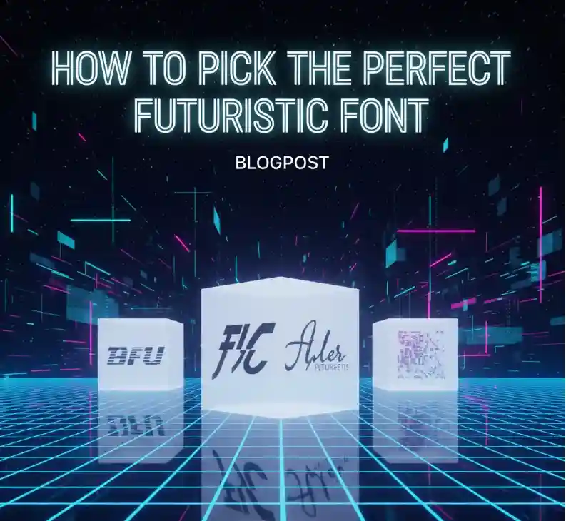
5. Top Futuristic Fonts You Can Try from NoahType
Here are some standout futuristic fonts from NoahType that align perfectly with sci-fi and tech themes:
- Kuasa Font – Strong geometric font ideal for logos or movie titles.
- Long Riding Racing Font – Perfect for high-speed branding and sports designs.
- Death Soldier Font – Bold, aggressive, and ideal for gaming visuals.
- Maybea Gale Display Font – Elegant futuristic font for posters and packaging.
- Nordkill Black Metal Font – A bold fusion of modern and dystopian aesthetics.
Each of these fonts captures a unique futuristic personality — from sleek and minimal to dark and powerful.
6. Real-World Examples of Futuristic Typography
Futuristic typography is everywhere:
- Tech companies like Tesla and SpaceX use minimal sans-serif fonts to express innovation.
- Movies like 2001: A Space Odyssey and Blade Runner used stylized letterforms to define their worlds.
- Video games often blend metallic textures with futuristic typefaces to emphasize immersion.
You can apply similar strategies by pairing NoahType’s display fonts with dynamic layouts or digital color schemes.
7. Common Mistakes to Avoid
- Overusing effects: Avoid adding too many gradients or shadows; let the font speak for itself.
- Ignoring spacing: Futuristic fonts need breathing room—proper kerning enhances legibility.
- Using too many styles together: Stick to one main futuristic font and one supporting neutral typeface.
- Not considering scalability: Ensure the font looks sharp on both large billboards and small digital screens.
8. Conclusion
Choosing the right futuristic font isn’t just about aesthetics—it’s about communicating innovation and vision. The next time you wonder how to pick the perfect futuristic font, remember to balance creativity, context, and clarity.