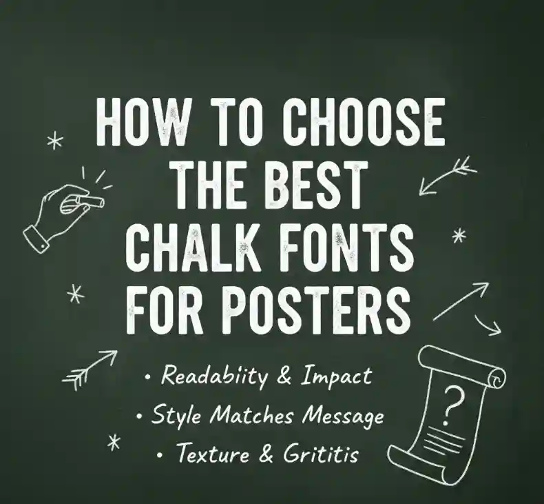
how to choose the best chalk fonts for posters
Table of Contents
- Introduction
- What Are Chalk Fonts?
- Why Chalk Fonts Are Perfect for Posters
- Key Factors to Consider When Choosing Chalk Fonts
- Best Chalk Fonts for Posters from NoahType
- Design Tips for Using Chalk Fonts Effectively
- Conclusion
- References

1. Introduction
Typography is the soul of every poster. It doesn’t just communicate words — it sets the tone, emotion, and style of your design. When your goal is to create a fun, handcrafted, and nostalgic feel, chalk fonts are a fantastic choice.
They combine the organic charm of chalkboard art with the flexibility of modern digital design. But with so many styles available, how do you pick the best one for your next project? This guide will show you how to choose the best chalk fonts for posters, along with professional design tips and some of our favorite picks from NoahType.
2. What Are Chalk Fonts?
Chalk fonts are typefaces designed to replicate the look and texture of chalk handwriting or chalkboard lettering. They often feature rough edges, powdery strokes, and irregular textures to mimic real chalk on slate.
Designers love chalk fonts for:
- Café and restaurant boards
- Event or festival posters
- Classroom and education materials
- Handmade product packaging
Their versatility and nostalgic aesthetic make them perfect for any project that needs to feel authentic, creative, or personal.

3. Why Chalk Fonts Are Perfect for Posters
Posters must grab attention instantly — and chalk fonts excel at this. Their textured, imperfect look creates depth and visual interest that smooth digital fonts can’t match.
They also carry emotional appeal: chalk fonts remind us of creativity, childhood, and craftsmanship. Whether you’re designing for a modern café or a community event, they inject a sense of warmth and originality.
4. Key Factors to Consider When Choosing Chalk Fonts
When selecting the perfect chalk font for your poster, keep these points in mind:
1. Readability
The first rule of typography: people should be able to read your message easily. Choose fonts that balance chalk texture with clarity, especially for large poster headlines.
2. Mood & Style
What emotion do you want your poster to convey?
- Playful & casual: choose sketchy or handwritten chalk fonts.
- Retro & elegant: opt for chalk-inspired scripts or serif fonts.
- Bold & modern: pick thick display chalk fonts.
3. Pairing Potential
You can mix chalk fonts with simpler sans-serif or serif fonts to create visual hierarchy. For example, use a chalk font for the headline and a clean typeface for body text.
4. Consistency Across Designs
If your brand often uses chalkboard-style designs, pick a font with multiple weights or alternates so you can keep a consistent tone across all materials.
5. Best Chalk Fonts for Posters from NoahType
NoahType offers a rich selection of handcrafted fonts that work beautifully for chalkboard-style posters. Here are five you’ll love:
Kinder School Sketch Font
This delightful sketch-style font perfectly captures the essence of chalk doodles on a classroom board. It comes in two versions — clean and rough — giving you creative flexibility for any playful or educational poster.
Fresh Juice Display Font
With its bold strokes and soft texture, Fresh Juice Font feels fresh and lively — ideal for food, beverage, or summer event posters. It brings the “chalk marker” vibe while staying highly legible.
Old Cartoon Display Font
If you want your poster to feel fun and nostalgic, Old Cartoon Font adds a classic hand-drawn touch. Its playful curves and subtle roughness resemble chalk sketches used in vintage animations.
Letterman Modern Script Font
Letterman Font mixes elegance with personality. Its smooth handwritten flow and textured edges make it perfect for chalkboard-style wedding or café posters.

6. Design Tips for Using Chalk Fonts Effectively
Here are expert tips to make your chalk font posters stand out:
Use Contrasting Backgrounds
A dark chalkboard background enhances texture and realism. Try pairing white or light gray chalk fonts with black, deep green, or slate textures.
Add Realistic Chalk Effects
In tools like Photoshop, add soft grain or smudge layers for authenticity.
Mix Font Styles
Combine a bold chalk display font (for headlines) with a light script (for subtext). This creates visual hierarchy and keeps your design engaging.
Keep It Balanced
Avoid overloading your poster with too many fonts or decorations. Chalk fonts already have character — let them shine.
Test for Print
Always print a small sample before finalizing your poster. Some chalk textures can look lighter on paper than on screen.
7. Conclusion
Chalk fonts are more than just a trend — they’re a timeless design element that brings warmth, texture, and authenticity to posters.
By focusing on readability, style, and creative use of texture, you can transform simple layouts into captivating works of art. Explore NoahType Studio’s font collection and find the perfect chalk-inspired typeface that matches your brand or project vision.
Whether it’s a café board, classroom announcement, or promotional poster, a carefully chosen chalk font can make all the difference.
