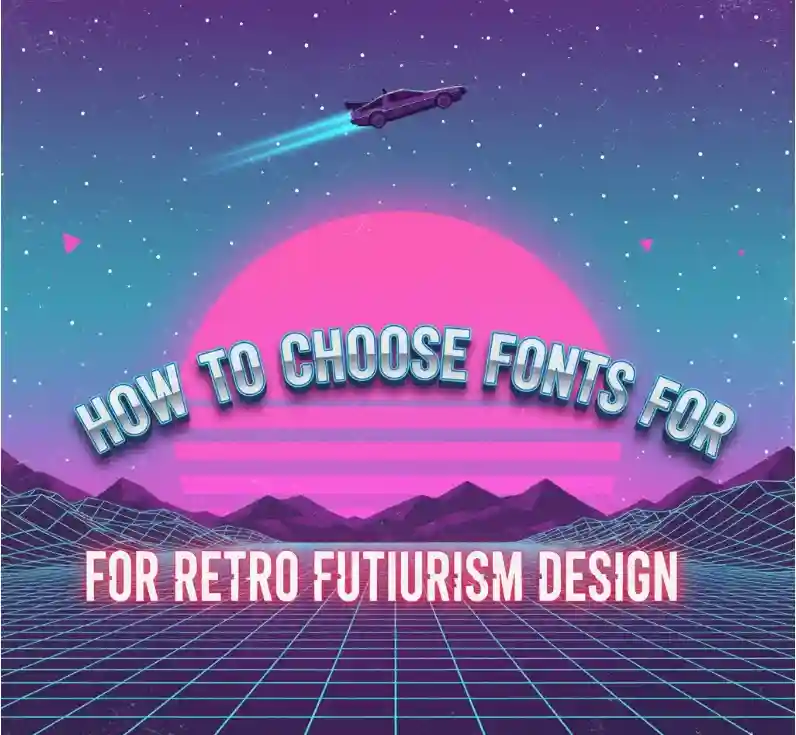
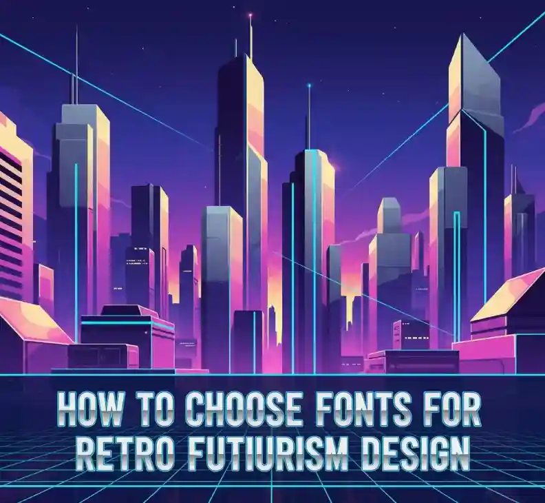
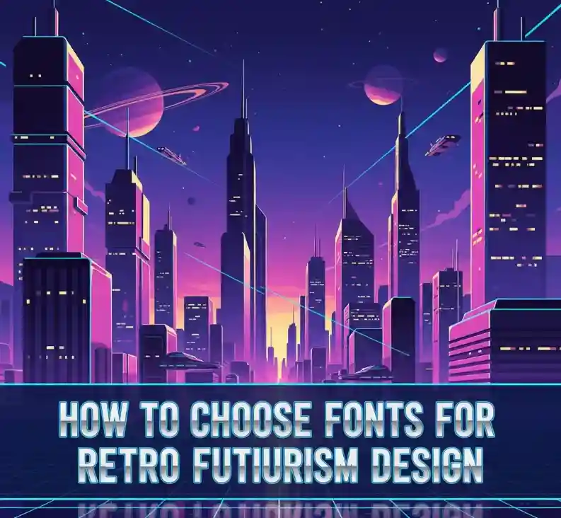
How to choose fonts for retro futurism design
Table of Contents
- Introduction
- What Is Retro Futurism?
- Why Fonts Matter in Retro Futurism
- Key Font Traits for Retro Futurism
- Font Pairing Tips & Design Tricks
- Font Recommendations from NoahType (with valid links)
- Applying It: Practical Steps
- Conclusion
1. Introduction
Retro futurism is the fusion of nostalgic styles with futuristic imagination, where fonts play a central role in conveying that duality. If you’re designing posters, logos, album art, or UI with a retro-futurism vibe, choosing the right font can make or break the aesthetic. In this article, we’ll walk through how to choose fonts for retro futurism design, with practical advice and real font examples from NoahType Studio.
2. What Is Retro Futurism?
Retro futurism draws from past imaginings of the future—think neon lights, space travel, rayguns, chrome surfaces, and bold geometric shapes. It combines the optimism of earlier decades about technology with modern design techniques. The visual identity often mixes art deco, mid-century modern, early sci-fi, and neon/synthwave elements.
3. Why Fonts Matter in Retro Futurism
Fonts are more than letters: they carry mood, era association, and visual texture. The font choice contributes to:
- Era cues: Serif vs sans serif, stroke styles, ornamentation
- Tone: futuristic, playful, sleek, gritty, sci-fi, nostalgic
- Legibility & hierarchy: display fonts for titles, simpler ones for body text
Using the wrong font can make a design feel off—too modern, too vintage, or mismatched.
4. Key Font Traits for Retro Futurism
Here are traits to look for when selecting fonts for retro futurism designs:
| Trait | Why It Helps | What to Look For |
|---|---|---|
| Geometric Shapes | Gives clean, futuristic structure | Angular or rounded sans-serif fonts; consistent stroke widths |
| Bold vs Thin Contrast | Adds drama and retro display effect | Bold for headlines; thin/light for supporting text |
| Decorative / Ornate Details | Nostalgic factor; adds uniqueness | Inline details, shadowed letters, futuristic ornamentation |
| Glow / Neon Friendly Styles | Retro futurism often uses neon effects/lighting | Thick letters with rounded edges (to apply glow without losing legibility) |
| Multilingual Support & Readability | Design might be used in various contexts; clarity under effects | Clear glyphs, well-designed punctuation, good spacing |
5. Font Pairing Tips & Design Tricks
- Combine one display font + one simple/sans serif body font
Use a decorative or geometric display font for titles/headlines, paired with a clean sans serif for body to balance the visual weight. - Layer styles (shadow, neon glow, gradient)
Apply effects selectively. For example, set the main letters with a bright glow, but keep supporting text flat or lightly stylized. - Use color and texture
Chrome, metallic gradients, neon blue/pink, dark space backgrounds can enhance retro futurism vibe. - Spacing & scale
Big, bold titles with large tracking (letter spacing) often work well. Pair with tighter spacing for subtitles/body text.
6. Font Recommendations from NoahType (with valid links)
Here are some NoahType fonts that can work well (or be adapted) for Retro Futurism design, including links verified still active:
- Fast Arena Font — strong display font with bold, racing / speed motif. Its dynamic character can evoke futuristic motion. noahtype.com
- Sports Technology Font — modern with futuristic touch; good for tech or racing themed retro designs. noahtype.com
- Race Gamer Font — playful, dynamic display font; could suit neon sign styles or video game.
- inspired retro futurism. noahtype.com
When you use them, try taking the bold/eye-catching font for titles/headings (e.g. “RACE GAMER”) and pair with a simpler clean font for supporting text.
7. Applying It: Practical Steps
Here’s a step-by-step to apply what you’ve learned:
- Define the mood first: Are you going more neon/80s, or more sci-fi minimalism?
- Select your headline font using traits above (e.g. geometric bold display). Use one from NoahType list or another that matches.
- Select supporting text font that’s legible and simpler (sans serif, less decoration).
- Mock up with effects: Try drop shadows, glow, metallic textures. See how type behaves under them.
- Test at different sizes & media: Screen vs print; big poster vs small card. Make sure readability remains.
8. Conclusion
Retro futurism is powerful when done well. The font choice is central to achieving that balance of nostalgia + futurism. By focusing on geometric and bold display fonts, mixing with cleaner support fonts, and applying visual effects carefully, you can create designs that transport viewers to both past visions of the future and your own imaginative present.
If you’re looking to experiment, check out the Fast Arena, Sports Technology, or Race Gamer fonts on NoahType — strong starting points that already lean toward futuristic aesthetics.