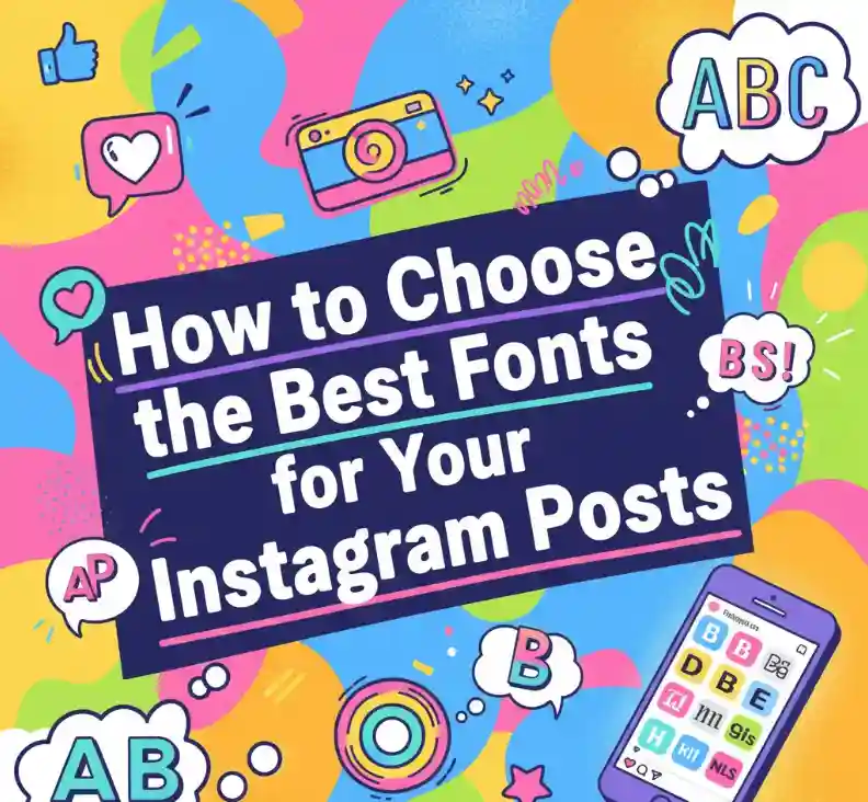
How to Choose the Best Fonts for Your Instagram Posts
How to Choose the Best Fonts for Your Instagram Posts
Table of Contents
- Why Fonts Matter on Instagram
- What Makes a Font “Instagram-Worthy”?
- Tips for Picking the Right Font
- Font Combos That Always Work
- Our Favorite NoahType Fonts for Instagram
- Final Thoughts
1. Why Fonts Matter on Instagram
Let’s be honest — Instagram is all about looks. You could have the best photo ever, but if your text looks off, your post won’t pop. Fonts aren’t just decoration — they set the mood, tell your story, and make your brand instantly recognizable.
Think of fonts as the outfit your words wear. The right one makes your content look stylish and confident. The wrong one… well, it’s like wearing socks with sandals. 😅
For a quick look at how visuals influence engagement, check out this great guide from Sprout Social.
2. What Makes a Font “Instagram-Worthy”?
An “Instagram-worthy” font should check three boxes:
- Readable — People scroll fast. If they can’t read your caption or story in one glance, they’ll move on.
- Aesthetic — Your font should fit your vibe — elegant, fun, minimal, or bold.
- Consistent — Using one or two fonts across your posts builds a strong, cohesive brand look.
Here’s a quick example:
If you run a minimalist brand, something clean like a sans-serif font will match your style. If you’re more into fashion or beauty, a script or handwriting font adds that personal touch.
You can learn more about matching fonts with your brand style from Canva’s Font Pairing Guide.

3. Tips for Picking the Right Font
✨ Tip #1 – Think About Your Brand Personality
Is your brand playful, bold, or classy? Match your font to that feeling.
- Playful → Handwritten or bubbly script fonts
- Bold → Display or modern serif fonts
- Classy → Elegant script or minimal sans-serif fonts
✨ Tip #2 – Test It on a Real Post
Fonts can look different depending on the photo or background. Always test your text overlay before posting.
✨ Tip #3 – Don’t Mix Too Many Fonts
Stick to a combo of 1–2 fonts. One for headers or quotes, one for body text. More than that and your design starts to look messy.
✨ Tip #4 – Keep It Mobile-Friendly
Remember, most people see your content on their phones. Pick fonts that stay clear and readable even in small sizes.
If you want more insight into how design choices affect engagement, check out HubSpot’s visual content marketing guide.
4. Font Combos That Always Work
If you’re not sure where to start, try these tried-and-true combos:
- Modern Serif + Handwriting Font → Perfect for fashion or lifestyle brands.
- Bold Display + Clean Sans Serif → Great for motivational quotes or brand promos.
- Elegant Script + Simple Serif → Ideal for wedding, beauty, or design content.
Want to dive deeper into content aesthetics? Later Blog has a solid article on building a cohesive Instagram aesthetic that pairs perfectly with good typography.
5. Our Favorite NoahType Fonts for Instagram
Here are some fonts from NoahType.com that’ll make your posts stand out (and get that extra “save” or “share” 💖):
- Kuasa Font – A luxurious calligraphy style that’s perfect for fashion, beauty, or lifestyle brands.
- Maybea Gale Display Font – Bold and modern, amazing for eye-catching quotes or promotions.
- Aurelia Forest Serif Font – Classy and clean with a natural vibe; great for minimalist aesthetics.
- Ruhun Black Metal Font – If you want something edgy and artistic for music or streetwear themes.
Each of these fonts brings its own personality — just like your brand.

6. Final Thoughts
Fonts are small details that make a big difference. The right font can make your Instagram feed look professional, cohesive, and full of character. So next time you plan a post, take a few extra minutes to pick a font that truly fits your message.