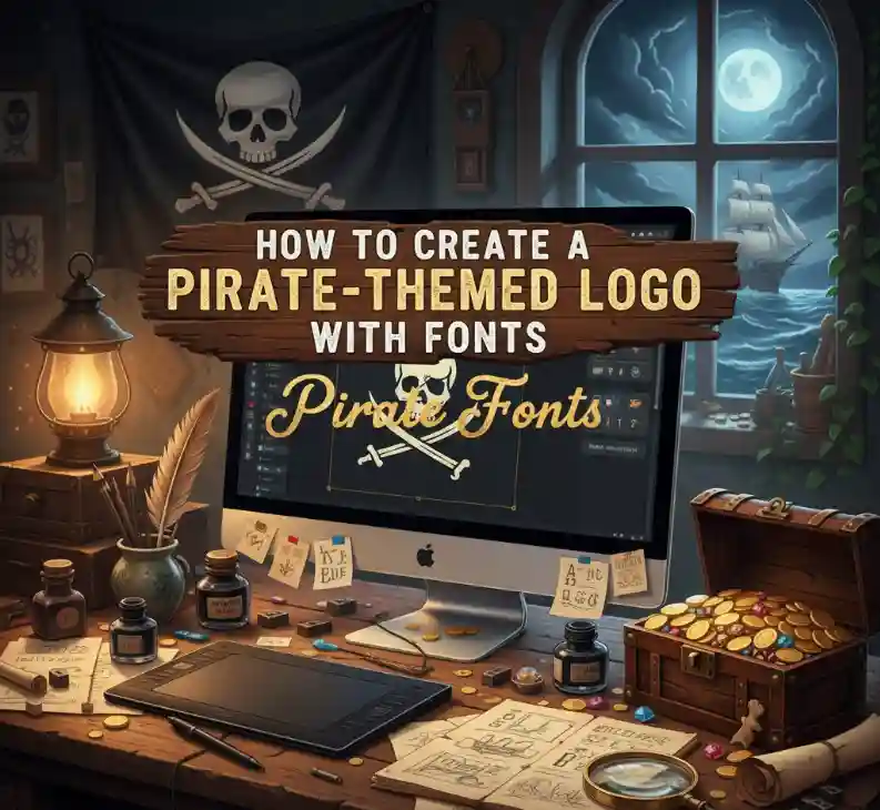
how to create a pirate-themed logo with fonts
Table of Contents
- Introduction
- Understanding the Pirate Aesthetic
- Choosing the Right Pirate Fonts
- Designing Your Pirate Logo Step by Step
- Recommended Pirate Fonts from NoahType
- Color & Texture Tips
- Final Touches and Branding Integration
- Conclusion
- References & Further Reading

1. Introduction
Creating a pirate-themed logo is an adventurous and imaginative process. It’s more than just choosing a font — it’s about evoking a sense of mystery, courage, and nostalgia. Whether you’re designing for a game, a craft brand, or a vintage apparel line, your typography plays a defining role in bringing the pirate spirit to life.
In this article, you’ll learn how to create a pirate-themed logo with fonts, from choosing the right typeface to adding texture and final branding touches.
2. Understanding the Pirate Aesthetic
The pirate aesthetic blends vintage maritime charm, bold storytelling, and handcrafted visuals. Think of old treasure maps, weathered parchment, ship flags, and ancient manuscripts. Each design element should remind the viewer of adventure, danger, and the open seas.
A good pirate logo typically includes:
- A strong typographic presence
- Nautical or gothic motifs (anchors, skulls, ropes)
- Aged textures or distressed edges
💡 Pro tip: The pirate aesthetic works beautifully when your typography feels imperfect but authentic — like ink on old parchment.

3. Choosing the Right Pirate Fonts
Your choice of font defines the soul of your logo. Pirate fonts usually fall into one or more of these categories:
- Blackletter fonts: Evoke medieval and gothic vibes.
- Display fonts: Bold and decorative, perfect for headlines.
- Script fonts: Add elegance or mystery when combined subtly.
Avoid overly modern or geometric fonts — they can dilute the vintage charm. Instead, focus on fonts that tell a story through texture, shape, and flair.
4. Designing Your Pirate Logo Step by Step
- Define your concept
Identify what your pirate brand stands for — adventure, mystery, or rebellion. - Choose your typeface
Pick fonts that match your brand tone — rough and powerful or elegant and mysterious. - Play with letter spacing
Pirate logos often feature uneven kerning or tight alignment for a hand-lettered effect. - Add supporting elements
Try skulls, compasses, ship wheels, or crossed swords as subtle accents. - Use texture smartly
Overlay grunge, grain, or parchment patterns to give your logo an aged feel. - Test in monochrome
A good pirate logo should work in black and white as well as in color.
📖 For more font inspiration, read Pollux of Geminorum’s article on pirate fonts.
5. Recommended Pirate Fonts from NoahType
Explore these handpicked pirate-style fonts available on NoahType.com, perfect for nautical or adventurous branding:
- 🏴☠️ Kuasa Font — Rugged and fierce, ideal for adventure or treasure map themes.
- ⚔️ Death Soldier Font — Gothic display font that brings dark pirate energy to your logo.
- 🌊 Maybea Gale Display Font — Curvy vintage design that feels both maritime and bold.
- 💀 Evilo Black Metal Font — Distressed and dramatic, great for titles or branding.
- ⚓ Aurelia Forest Serif Font — A refined serif with a historical touch for elegant pirate designs.
Each of these fonts is crafted to evoke timeless adventure and authenticity — the core of every great pirate logo.
6. Color & Texture Tips
Color and texture transform your typography from good to unforgettable.
Best Pirate Color Palettes:
- Deep navy blue (ocean)
- Burnt brown or sepia (aged parchment)
- Gold and brass (treasure & luxury)
- Crimson red (danger or rebellion)
Textures that Work:
- Weathered paper
- Rough wood grain
- Grunge metal
- Ink splatter
Combine subtle gradients or overlays to make your text look aged and sea-worn — perfect for pirate-themed branding.

7. Final Touches and Branding Integration
Once your logo looks strong on its own, test it across various media:
- Print (labels, packaging, apparel)
- Digital (social media, website)
- Merchandise (mugs, patches, banners)
Make sure it stays recognizable in both full color and monochrome.
A well-designed pirate logo should make your audience feel like they’re part of an epic voyage — that’s the emotional power of good typography.
8. Conclusion
Typography is the heart of every great logo, and in pirate-themed designs, it’s what gives your brand its soul.
By selecting the right fonts, colors, and textures, you can create a visual identity that captures the adventurous spirit of the seas.
Explore more at NoahType’s font collection and start your next treasure-worthy logo today.
