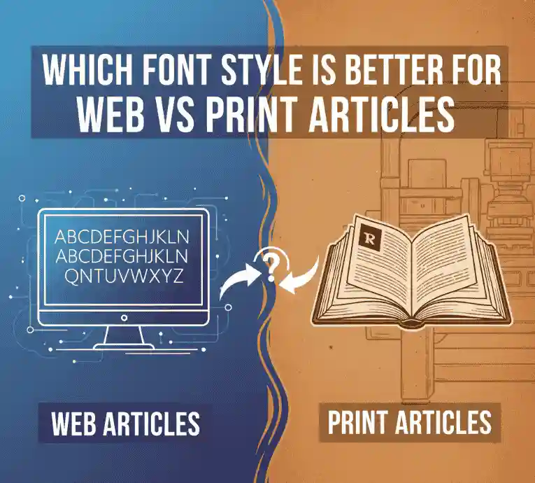
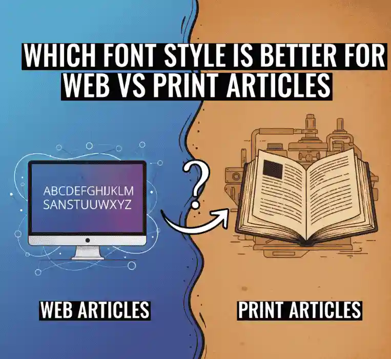
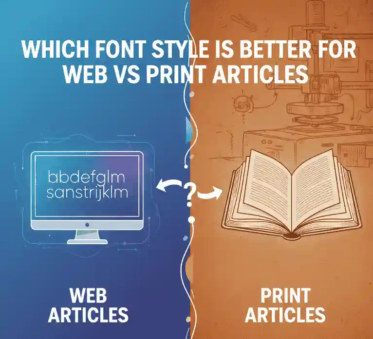
Which Font Style Is Better For Web Vs Print Articles
Table of Contents
- Introduction
- Why Font Style Matters for Readability & Experience
- Serif vs Sans-Serif: Definition & Key Differences
- Web Typography: Best Practices & Considerations
- Print Typography: What Works Best on Paper
- Hybrid / Cross-Media Font Strategy
- Tips for Choosing & Pairing Fonts
- NoahType Font Examples & Internal Links
- Conclusion
1. Introduction
When designing content—whether for blogs, e-books, magazines, or printed reports—you often confront this question: “Which font style is better for web vs print articles?”
Should a sans-serif font be reserved for digital screens and serif fonts for print? Or can one typeface family serve both media effectively? In this article, we’ll explore the strengths and tradeoffs of each style, best practices for web and print, and real examples from NoahType’s catalog to help you decide with confidence.
2. Why Font Style Matters for Readability & Experience
Typography isn’t just visual decoration—it sits at the heart of how readers perceive, engage with, and retain your content. Some reasons it matters:
- Legibility vs readability: Legibility is how easily you can distinguish individual letters; readability is how comfortably the text can be read over a stretch. Good typography supports both. (Wikipedia on Typography) Wikipedia
- Medium constraints: Screens introduce pixelation, hinting issues, and variable resolution; print deals with ink spread, dot gain, paper texture, and lighting.
- Tone & brand voice: A classic serif evokes tradition and formality; a clean sans-serif feels modern and minimalistic.
- Cognitive load: A poorly chosen font strains the eyes, making reading tiring and reducing retention.
Because web and print differ so much, making a smart font choice per medium (or a coherent cross-media pairing) is essential.
3. Serif vs Sans-Serif: Definition & Key Differences
What Is a Serif?
A serif is a small line or stroke attached to the end of a larger stroke in letters. A typeface with these features is called a serif (or serifed) font. (Wikipedia, Serif) Wikipedia
Serif typefaces are historically rooted in print and can be divided into subgenres like Old-style, Transitional, Didone, and Slab serif. Wikipedia
What Is Sans-Serif?
Sans-serif literally means “without serif.” Sans-serif typefaces omit those small strokes and typically have more uniform stroke widths. They are widely used digitally because fine details in serifs sometimes don’t render cleanly at smaller sizes or on lower-resolution screens. (Wikipedia, Sans-serif) Wikipedia
Strengths & Tradeoffs
Serif Fonts
- Strengths on print / general reading: Serifs can subtly guide the eye across lines in long text, giving a “flow” effect. As Adobe notes, serifs often lend more legibility in small sizes because they help distinguish letterforms and strengthen inter-letter differentiation. Adobe
- Tradeoffs on screen: If not properly hinted or rendered, the fine strokes of serifs may blur or distort at smaller sizes or on low-DPI devices.
Sans-Serif Fonts
- Strengths online: Simpler shapes tend to render more cleanly at small sizes and across devices. Webflow’s guide highlights that sans-serif fonts are generally easier to read on screens, since they avoid extra complexity in tiny letterforms. webflow.com
- Tradeoffs in print: In long printed passages, a sans-serif font may feel visually “lighter” or less anchored compared to a serif alternative.
What Do Studies Show?
- The PrintIndustry newsletter states plainly: “Serif type is easier to read in print, while sans-serif is easier on screens.” printindustry.com
- Some readability research suggests that differences in comprehension or reading speed between serif and sans-serif are minimal and depend more on font design, spacing, and layout than the presence of serifs. User Experience Stack Exchange
- The “Font Readability Research” article from Geniusee walks through experiments that question the conventional wisdom of serif superiority in all contexts, noting that many variables intervene (line length, x-height, stroke contrast). Geniusee
In summary: serifs and sans-serifs each have domains of advantage. The “right” choice often depends on context and typographic execution more than rigid rules.
4. Web Typography: Best Practices & Considerations
When publishing text online, you need to optimize for many constraints:
- Legibility at multiple sizes: Body text is often 14–18 px. Fonts must hold up across breakpoints.
- Hinting & web optimization: Fonts designed for on-screen use (with hinting instructions) perform more cleanly.
- Line length and spacing: Maintain around 45–75 characters per line and generous line height (1.4 to 1.6×) to reduce visual fatigue.
- Moderate contrast: Highly contrasting strokes (very thin thin strokes, very heavy thick strokes) may blur or cause “dazzle” on some screens.
- Limit decorative uses: Use ornate or display fonts for headings or accents—not for long body text.
- Font loading & performance: Use efficient formats (like WOFF2), subset fonts when possible, and set sensible fallback fonts.
Because many modern screens have high DPI, some serif fonts—if well designed—work well online too. But a safe, reliable route is using well-crafted sans-serif (or screen-optimized serif) fonts for body text.
5. Print Typography: What Works Best on Paper
Print allows for consistency and high fidelity, but also requires attention to specifics:
- Ink traps / robust details: Good print fonts often include subtle design features (like ink traps) that prevent fine serifs from closing under ink spread.
- Optical sizing: Many professional font families offer “text” cuts (for body) and “display” cuts (for larger sizes).
- Contrast & refinement: Delicate strokes, refined serifs, and higher contrast are more feasible in print than on screen.
- Paper & printing quality: Performance depends on how well the paper and press reveal fine details—fonts with open counters and sturdy strokes fare better.
- Long-form reading: Because of the guiding function of serifs and the stable medium, serif fonts remain the preferred choice for many printed books, magazines, and reports.
Thus, for long-form printed content, serif fonts are still often the default for good reason.
6. Hybrid / Cross-Media Font Strategy
Many brands publish content both online and in print. To maintain consistency while optimizing for each medium, consider:
- Superfamilies / unified design systems: Use matching serif + sans-serif styles from the same design family so the tone remains coherent.
- Serif headings + sans body text: Use serifs for decorative headings and sans for body text (especially online).
- Screen-optimized serif variants: Use a serif cut tuned for digital (slightly heavier strokes) so it doesn’t degrade on screen.
- Test across devices & print: Preview in web browsers, mobile, and printed proof to ensure legibility.
- Limit contrast in transitions: Avoid jarring shifts in style—use transitions that feel natural and aligned.
With a thoughtful hybrid strategy, you can get the best of both worlds: personality in print, clarity online, and brand cohesion across mediums.
7. Tips for Choosing & Pairing Fonts
- Always prioritize legibility over novelty—fonts that readers strain to read will reduce engagement.
- When pairing serif + sans-serif, balance x-height, weight, and proportion so they visually harmonize.
- Use contrast thoughtfully, not wildly—contrast should support hierarchy, not fight for attention.
- Stick to 2–3 typefaces max per project to avoid visual clutter.
- Fine-tune kerning, letter spacing, and line spacing—small adjustments can make a big difference.
- Test at reading sizes and in real contexts—what looks good in a mockup might fail on real devices or print.
- Ensure proper licensing and fallback stacks—always specify backup fonts in CSS and verify webfont licenses.
8. NoahType Font Examples & Internal Links
Here are some NoahType fonts from your own catalog with internal links — use them as headings, accents, or body text per medium:
- Abigail Enzo Serif Font
A refined serif face — great for headlines in print or accent text online. - Allegation Modern Serif Font
A contemporary serif with strong presence — ideal for magazine titles or hero headers. - Alie Jasmine Display Font
A stylish display serif—use it sparingly for covers or prominent headings. - Achilleas Calligraphy Font
A decorative calligraphy style—best used for accents or pull-quotes, not long paragraphs. - Ajaran Black Metal Font
Bold and dramatic—works for thematic headers, posters, or visual highlights (not for body text).
By embedding links to your own fonts in an informative context, you guide your readers to explore your catalog while delivering value.
9. Conclusion
So, which font style is better for web vs print articles? The best answer is: it depends, but with guiding principles:
- For web: Use sans-serif or screen-optimized serif fonts for body text to maximize clarity across devices.
- For print: Serifs continue to dominate long-form reading, thanks to their guiding strokes and print adaptability.
- Hybrid strategies combining serif + sans from a unified family often yield the most polished, consistent results.
- Always test—what looks good conceptually might fail in actual display or print.
By pairing this knowledge with your own NoahType font catalog, you can build typographic systems that look great, read well, and promote your products in context.