Best Brush Fonts for Logo Design: A Complete Designer’s Guide
Table of Contents
- Introduction
- What Is A Brush Font & Why It’s Powerful for Logos
- Key Features to Look For in Brush Fonts for Logos
- Styles & Moods: Matching Brush Fonts to Brand Personality
- Tips for Using Brush Fonts Effectively in Logo Design
- Showcasing Outstanding Brush Fonts (Including NoahType Picks)
- Common Mistakes to Avoid
- Conclusion

1. Introduction
Logos are often the first thing people see—and remember—about a brand. Using the right font can make your logo feel authentic, bold, artistic, or friendly. In recent years, brush fonts have surged in popularity in logo design, thanks to their expressive, handcrafted appearance. But choosing the brush font that both looks great and works well for your brand takes more than just picking something that looks “cool”.
In this article, you’ll learn what makes a brush font ideal for logo use, the styles available, how to use them well, and see some excellent examples—especially some from NoahType—that can inspire your next logo project.
2. What Is A Brush Font & Why It’s Powerful for Logos
A brush font (or brush script) is a typeface designed to mimic strokes made by brushes, paint, or ink. These fonts often have irregular shapes, varying stroke widths, a sense of flow, texture, and imperfections that mimic human handwriting or painting. Because of that:
- They bring personality and emotion into a brand’s identity.
- They feel more approachable, artistic, and genuine than many geometric or overly clean typefaces.
- They tend to stand out when used for display work, such as a logo or headline.
According to design resources, brush fonts are particularly effective in headline and branding work because they combine visual impact with expressive feel. Din Studio+2Design Shack+2
3. Key Features to Look For in Brush Fonts for Logos
When choosing a brush font for a logo, you’ll want to make sure it has certain features. Here are the essentials:
| Feature | Why It Matters |
|---|---|
| Legibility at different sizes | A logo must work on a business card, website header, signage. If the brush stroke is too elaborate, small details might be lost. |
| Distinctive style / personality | Whether it’s rugged, elegant, casual, or vintage, the style should match your brand identity. |
| Balance of texture and simplicity | Too much texture or decorative effect can make it hard to pair with other design elements; too little and it loses its brush feel. |
| OpenType features (ligatures, alternates, swashes) | These give you flexibility—e.g. unique variations for certain letters to make the logo more custom. |
| Support for multiple character sets | If your brand uses special accents or smaller languages, you’ll want a font that supports what you need. |
| Scalability & format variety (OTF, TTF, WOFF etc.) | Ensure the font performs well in both print and digital contexts. |
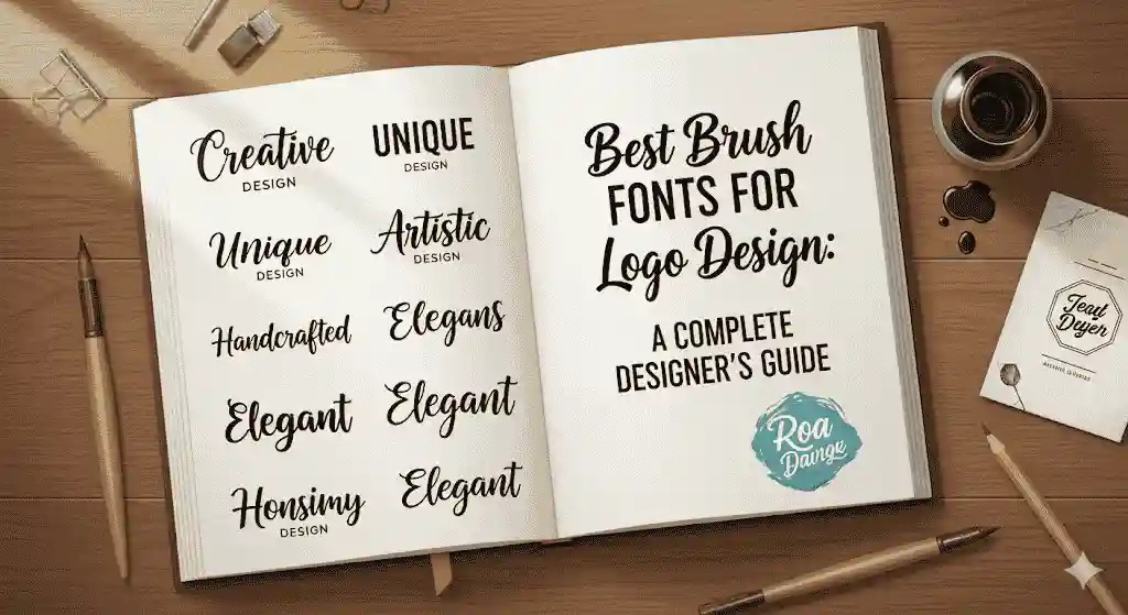
4. Styles & Moods: Matching Brush Fonts to Brand Personality
Brush fonts are not “one size fits all.” The style of the font must align with the brand mood:
| Brand Mood / Sector | Typical Brush Font Characteristics |
|---|---|
| Artisan / Handmade / Craft | Rough edges, irregular strokes, natural flow. |
| Luxury / Boutique | Elegant, flowing swashes, thinner strokes, more polished texture. |
| Bold / Adventure / Outdoors | Heavy strokes, rustic texture, perhaps distressed or dry-brush effect. |
| Youthful / Casual | Playful curves, less rigid baseline, some expressive features. |
| Retro / Vintage | Simulated brush & ink — sometimes with fading texture, retro color pairings. |
Think of the brand’s target audience: the font should help express values, tone, and feel in one glance.
5. Tips for Using Brush Fonts Effectively in Logo Design
Here are practical tips to put brush fonts to best use:
- Use them for logos, headlines, or standout elements, not long text blocks. Because of their decorative nature, they can be hard to read in paragraphs.
- Pair with simpler fonts (sans serif or clean serif) for secondary text, tagline, or supporting content. This contrast helps readability and balance.
- Color contrast matters — light text on dark background or vice versa; sometimes adding shadow or outline helps clarity.
- Test size & reproduction — make sure they look good when scaled down (e.g. favicon) or scaled up (signage).
- Avoid overusing complex swashes; sometimes a cleaner baseline or simpler alternates work better.
- Stay consistent with the brush style across brand touchpoints: packaging, website, printed material.
These guidelines are echoed in expert design resources. Dita Type+2Adobe+2
6. Showcasing Outstanding Brush Fonts (Including NoahType Picks)
Here are some excellent brush fonts—mix of inspirations and some great options from NoahType to consider for your logos.
Inspiring Examples (from around the web)
- Pondspell Brush — natural, hand painted texture; great for brands wanting an authentic rustic vibe. iDevie+1
- Never Brush — bold, slightly rough edges; works well for adventurous or outdoor-oriented logos. iDevie
- Rougthy Brush Font — expressive strokes with noticeable texture. iDevie
NoahType Recommendations
Here are some brush fonts from NoahType that align well with what makes a logo font stand out. (You can link these to their product pages.)
- NoahType “Ashly Tabitha ” — Bold, energetic strokes; good for bold youth brands or streetwear.
- NoahType “Anxious Night ” — Flowing, refined brush strokes with swashes; ideal for boutique, beauty or luxury brands.
- NoahType “Black Anxiety ” — Rough texture, dry-brush effect for outdoorsy or rustic identity.
- NoahType “Busy Love ” — Casual, friendly; perfect for café logos, local shops, or creative business.
- NoahType “BrotherGlow ” — Casual, friendly; perfect for café logos, local shops, or creative business.
When using these picks, you can try some of them in mockups (signboard, business card, t-shirt) to see how the brush texture holds up under real-world use.
7. Common Mistakes to Avoid
Even with gorgeous brush fonts, designers sometimes make errors. Here are pitfalls to watch out for:
- Overly complex brush details that vanish at small sizes.
- Poor contrast between font and background.
- Using brush font for everything: logos, body text, headlines—leading to visual chaos.
- Ignoring spacing/kerning issues (brush fonts often have uneven shapes).
- Not considering reproduction in print: actual print may lose texture or fill poorly.

8. Conclusion
Brush fonts offer tremendous potential for logo design: personality, character, emotional resonance. But their power needs to be harnessed wisely. Choose fonts that match your brand, ensure readability, use them judiciously, and pair with cleaner supporting typefaces.
If you’re designing a logo soon, try experimenting with a few of the NoahType brush fonts listed above. See which style feels most “you”—bold & rough, elegant & refined, or casual & friendly. The right choice will help your logo not only look beautiful, but become memorable.